Ko-autori
-
Arhitektonski biro
-
Saradnici (članovi tima):
-
Vanredni saradnici:
-
Lokacija:
Magyarország, Budapest, Könyves Kálmán körút
Investitor:
-
Budžet:
-
Opisni tekst o radu:
My thesis design project is a new headquarters for the Deaf and Hard of Hearing Centre in Budapest. Apart from giving room to the organisation management, and programmes, the building would give place to special courses, and a clinic service which could help the integration of the deaf and hard of hearing people into the community. It is important that the building can support it’s visitors with a clean, easily accessable environment.
Fort the deaf people the difficulties in communication might cause weaker social skills, and requires special help. While a person with normal hearing abilities translates many aspects of a conversation through the voices and sound, the deaf and hard of hearing people rely much more on the gestures of the whole upper body. To provide sufficient space with good visibility and proper distances for communication, the transparency of the floorplans and layout is essential, which means the narrow and complicated corridors and wall connections are avoidable.
The location of the project is in the close neighbourhood of the organisation’s sport facilities. Towards the center of the sport facility the traffic noises decrease, while the area of the green increases. This central calm and unbuilt area is the project’s location.
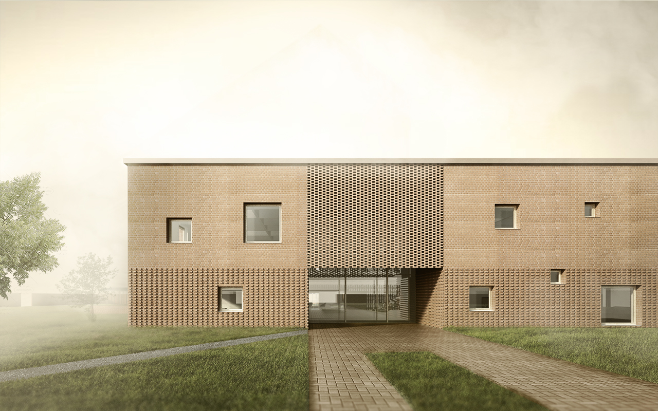
With a surrounding wall I create an enclosed area where the inner and outer parts are equally important, and the whole site can work as a structure/system of space. The main building’s location is carefully chosen to provide connection with the surroundings, and give the opportunity later to expansion. Apart from the main bulding there are three tempered pavilion with recreational functions.
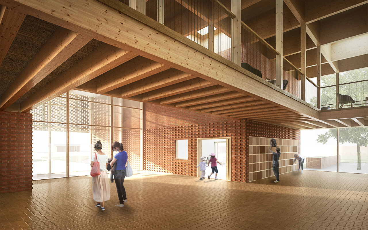
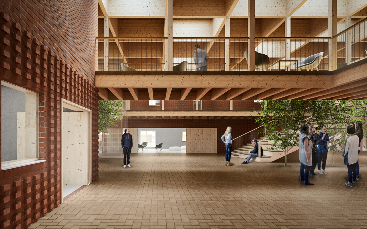
Articulation of the main building: four blocks share the same roof covering the space between the them. The corridor and the common areas of the first floor are hanging from the shared roof ensuring the free layout of the ground floor. The floor and the sling are a uniform wooden structure. The chosen materials help to distinguish the skin tones from the built environment providing better visual support while communicating with sign language. To prevent echoing the hard materials are not ideal.
On the first floor in the blocks the rooms are more closed to support special functions. The layout ont he ground floor is more opened but clearly articulated, here the community’s role is more important. This area gives space for social events, and community activities.

